Running a business successfully is a multifaceted process. To get anywhere with buyers, clients or patrons, you first have to convince them that using your company is the best possible choice. This issue is two-fold: first, you need to get traffic to your site. Then, you need to get them to convert. If you’re traffic numbers look great but you can’t figure out why conversions are low, implement these 5 steps to create a site that converts.
1) Use Testimonials
Sharing customer testimonials will help create buyer trust and reduce the risk of purchase or becoming a patron of your business. Your website is essentially the handshake of your business – it bridges the gap between your business and new clients, and is often the first impression a visitor will get. Displaying honest, complimentary feedback from former or repeat clients will encourage new browsers to follow through with purchase, signing up, filling out a contact form or whatever it is you want them to do. Reviews and testimonials featured on a website have been shown to increase sales by 18%. Share your testimonials, and you can ensure that your company provides a successful first impression.
2) Focus on One Primary CTA
What is your ultimate goal, or call to action, for visitors to your site? Do you want them to sign up for a free trial? Make a purchase? Join your email marketing newsletter? If you give browsers too many options, you won’t help them – you’ll overwhelm them, and they will leave without converting. Simplify and streamline your CTA by focusing on just one. The Sims 3, one of the best-selling PC gaming franchises of all time, had four primary CTAs on their site. For their audience and goals, four was far too many. They focused on cutting back CTAs through a series of A/B testing, and determined which CTA combination provided the best results. They ended up narrowing it down to one CTA – signing up for registration to earn something for free. This change improved conversions drastically by 128%.
3) Improve Customer Service
Customer service is something we tend to think can only happen within a business’ brick and mortar location, but it is more than doable in online settings. Providing great customer service on your site can be as simple as anticipating your customer or client needs. If you deal in ecommerce retail specifically, a shipping timetable that allows buyers to enter their zip code and estimate their package arrival date is helpful, particularly around the holidays. All businesses can benefit from adding an FAQ page or chat feature to their site. FYI, live chat has the highest rate of customer satisfaction, with 73% of users feeling like their needs were met, and has been shown to increase conversion by 31%. If you can improve your customer service and make visitors feel as if you’re on their side, you can effectively charge 20-200% more than competitors. But if your customer service is subpar, a reported 68% of buyers will stop supporting your business.
4) Simplify Website Design
Similar to cleaning up and paring down CTAs, your site should be free of clutter. If you have too many odds and ends (no matter how cool they are), you will distract users and cause them to turn away. Create a hierarchy of site goals. We have some some amazing website templates we built for conversion. What do you want visitors to think about, look at or do? Design your website based on this, and skip the rest. Popular Highrise CRM software 37signals compared the conversion rate of their original site design, which was busy with multiple images, buttons and links, to a new version that was content heavy with clean design. As a result, they increased conversions by 37.5%. Conduct a website audit to determine which items are cluttering your page, and get rid of everything that isn’t necessary.
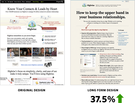
Source: Signal v. Noise
5) Shorten Your Homepage
One way to declutter your site is to delete half of it. Seriously. You may think you have a ton of great features on your website (and you probably do), but if users have to keep scrolling and scrolling to get what they want, they’ll get overwhelmed. Daily Burn, an online fitness community formerly known as Gyminee, had a homepage design with a lot of fancy add-ons. Think extensive screenshots, a preview of the latest blog post and a live calorie ticker. It was all cool stuff – but was it necessary? The founders of Daily Burn deleted half the page in split test, which revealed that the shorter site provided a 20.45% increase in conversions. DesignBoost, an online school for designing mobile apps and landing pages, tried the same thing. They cut their homepage almost in half, and increased conversions by 13%.
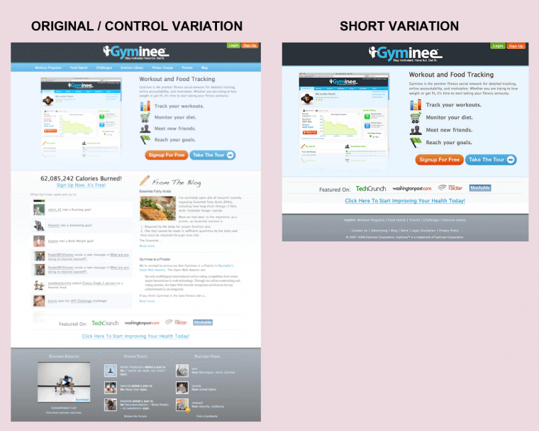
Source: Kissmetrics
Conclusion
Incorporate as many of these changes into your site to focus your users and encourage them to convert. The easier it is for them to achieve the goals you’re driving them toward, the better. A streamlined site that is easy for users to navigate will guide them to your CTAs and bring you better conversions.

Leave a Reply
You must be logged in to post a comment.