
You put a lot of effort and probably spent a lot of money to get people to your landing page. Naturally, you want to maximise those conversions. The good news is that you can apply proven strategies for landing page optimization to improve lead generation and sales.
Here are eight such strategies to boost your landing page conversion rate. Let’s jump into this guide.
1) Make a great first impression
There’s truth to the saying “first impressions last.” According to a study conducted at Carleton University in Canada, it takes just 50 milliseconds for a person to form an opinion about a web page. If a user creates an initial negative impression of your landing page, they’re less likely to respond to it positively.
Luckily, current eCommerce platforms such as Shopify, POSApt, WooCommerce,… have great customization functionalities and can help you achieve a landing page that leaves a great impression on your customers.
How do you create a landing page that delivers the best first impressions? Here are a few tips:
2) Write powerful headlines
Did you know that 80 percent of website visitors never go past the headline? Only two out of every ten readers read the content. Therefore, for landing page optimization, you must write a strong headline that encourages prospects to read the rest of the content.
A good headline is simple but intriguing enough to pique your reader’s curiosity. Ideally, it should be between six to eight words.
We all sometimes struggle with content generation, so you can turn to AI-powered tools such as copy.ai, jasper.ai, or recently popular chatGPT to help you tackle such responsible task as coming up with a powerful headline.
All these tools are based on natural language processing, so they can instantly generate human-like phrases and paragraphs.
Despite the formidable capabilities of AI writing tools in facilitating content creation, it remains paramount to utilize an undetectable AI writer to achieve the most optimal outcomes.
Personalized instructional headlines containing numbers also perform well. Moz conducted a study where readers were asked to rate different types of headlines on the same subject. Headlines with numbers had the highest scores, followed by headlines that addressed the reader:
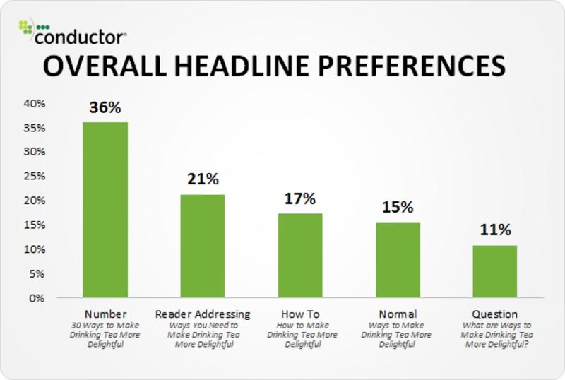
There are many reasons listicles with titles like “5 Reasons You Should Sign Up for Our Product” perform well. They set the reader’s expectations. If your landing page promises to provide a solution for the user’s problems in just 24 hours, they’re more likely to download it and expect a solution in the same amount of time.
Keep your copy simple
You don’t want your potential customers to go past the headline only to end up trying to make sense of paragraphs filled with jargon. Keep your content short and straightforward.
Bear in mind that your copy should help readers understand how the product or service solves their problem. Therefore, you shouldn’t focus too much on the features. But instead, explain how your product’s characteristics benefit the readers.
Deliver a consistent experience
Consistent user experience is essential in making a positive first impression. So, make sure the landing page design is compatible with your PPC ads, email marketing copies, etc. Not just consistent in terms of visuals but also in terms of the language used.
Optimize for mobile
According to Statista, mobile devices accounted for 61% of organic search engine traffic in the second quarter of 2021. The number is probably higher today.
That means your landing page has to be optimized for mobile devices. Not only does this boost first impressions and user experience, but it also has a direct impact on conversion rates.
To optimize your website for mobile devices, use responsive page designs, activate accelerated mobile pages (AMP), resize images and pop-ups, and remove Flash elements. A responsive page design allows your website to fit any screen size. Resizing images and removing Flash elements, on the other hand, reduce your website’s page load time. If the images are still larger in size, try to remove the background from the image using a free image editor tool online.
3) Optimize the Appearance of your CTA button
Never leave your website visitors guessing what they’re supposed to do next. Most of them will wander off and fail to convert. That’s why prominent call-to-action buttons are critical to landing page optimization.
Here are some tips on how to improve your CTA:
Color
Generally speaking, red, orange, green, and blue are the best performing colors for CTAs. But don’t just pick the colors blindly. Consider the design of your website. For instance, if your website background is dominated by orange, an orange CTA would be invisible.
To find the contrasting CTA color for your website, go to the color wheel and identify the exact color of your website background. Then look at the color across it on the wheel. That’s the complementary color that will create the most contrast.
Complementary colors perform well, but they’re not your only option. You can try triadic colors, too. The most common examples of triadic colors are red, yellow, and blue. These are the three colors distributed evenly on the color wheel.
Aim to get a CTA color that makes your buttons pop. You’ll also have to test out different colors to find the perfect option for your website.
Size
Larger CTAs grab more attention. But you don’t want to overdo it. When the CTA button gets too big, it steals the show from your copy, often because designers forget to properly resize images used in CTA elements.
It can also affect user experience. Finding the right size for your CTA is essential to landing page optimization. You’ll have to A/B test different sizes to identify the ideal CTA size for your website.
Shape
CTA buttons with rounded corners tend to be friendlier to the human eye than those with sharp corners. They help people focus on the text and make the buttons appear clickable. That’s why all major businesses, including Apple, use them. Meanwhile, buttons with sharp corners are closely associated with banner ads, which may scare away readers.

You should have only one button on your landing page, the CTA. If that’s not possible, none of those other buttons should outshine the main CTA.
4) Optimize your lead capture form
A lead capture form collects the customer data you need to nurture your leads through email marketing. Sadly, too many businesses make the mistake of asking for more data than they need. Most users don’t have the patience to fill out a form that doesn’t seem to end. In addition, they tend to think twice about sharing too much personal data with an unfamiliar brand.
Therefore, keep your form as short as possible to ensure landing page optimization.
Consider this lead capture form from Shotkit, a photography website:
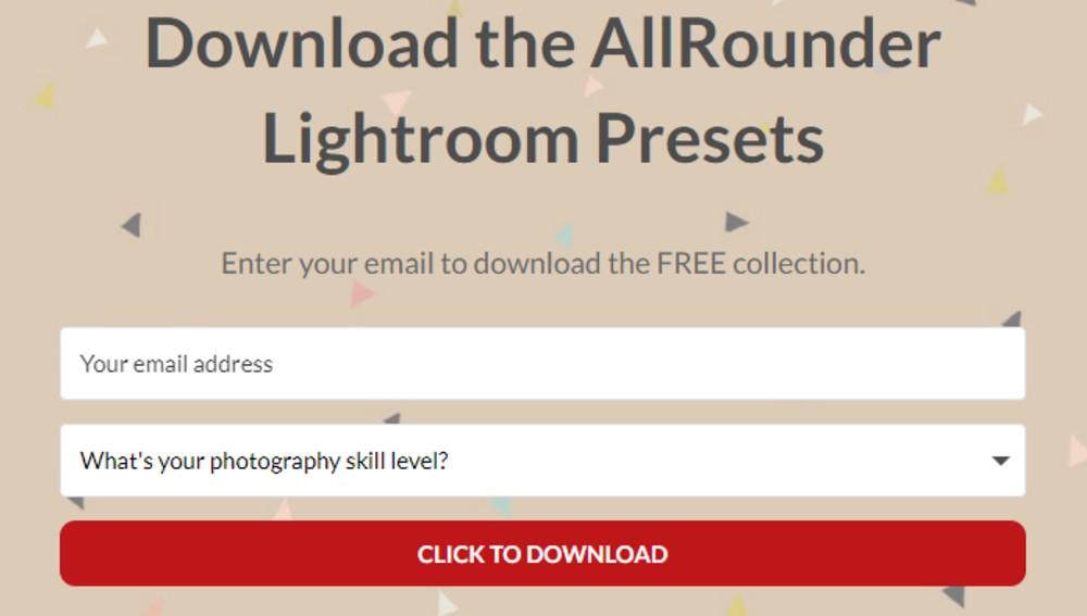
The form only has two fields: the user’s email address and a drop-down box to indicate their skill level. These allow the website to add the user to their mailing list and place the new subscriber into a predefined audience segment.
Also, give your users a seamless experience when filling the form. You can do this with predictive text and optimized keyboards. For instance, a numeric keyboard should appear instead of a QWERTY layout if you’re asking for the lead’s phone number.
If you have to collect a lot of data at once, you can use a multi-page form. These forms are less tedious and annoying. Use them alongside a progress bar to show your leads how close they are to completing the form.
When sending out your emails, make sure you use email tracking tools to determine when each has been opened. That can help you determine when the right time is to send that next email.
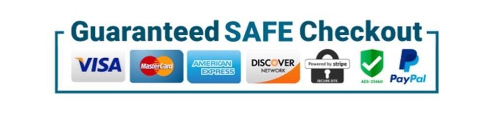
5) Include trust badges and promises
Trust badges are critical when you want visitors to transact on your website. Badges from reputable companies like Norton and MasterCard make your landing page look secure and trustworthy. That boosts customers’ confidence in your website, making it easier for them to convert.
So, find suitable trust badges in your niche and include them on the landing page. They’re especially critical for eCommerce businesses. Online stores should use pop-up widgets or embedded checkout forms to customize the checkout process and enhance user experience.
Besides trust badges, you should also display satisfaction guarantees, risk-free guarantees, and money-back guarantees. However, you should display these badges only if you have the corresponding guarantees in place. Otherwise, you might need to check with your state’s trade regulations regarding returns and refunds.
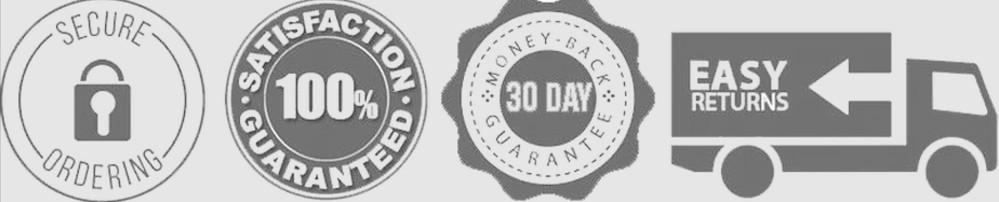
These badges show your brand’s confidence in its products. Interested buyers are also more willing to buy from you when the product is covered with a warranty.
6) Obtain recommendations and feedback from prior customers
Customer feedback, testimonials, and recommendations are collectively known as social proof. The goal of social proof is simple: to show potential customers that your product or service is tried and tested.
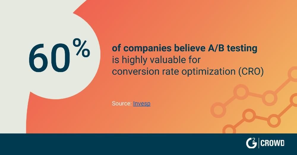
Customers value these reviews. A 2017 report by G2 Crowd showed that 92.4% of B2B buyers are more likely to buy a product once they’ve read a trusted review. Therefore, including testimonials on your landing page could have a significant impact on your conversion rates.
You don’t have to fill your landing page with testimonials. Simply pick the best of the bunch. If you feel the need to showcase more reviews, consider creating a separate testimonials page.
Publish real testimonials that tell a story of how your product solved someone’s problem. Not all testimonials are adequate, though. More importantly, the testimonial has to link to a real person.
Check the following customer feedback examples below:

These testimonials look and feel genuine. Moreover, they explain how the product solves a customer’s pain points by using real-life examples.
7) Use CTAs that encourage users to take action
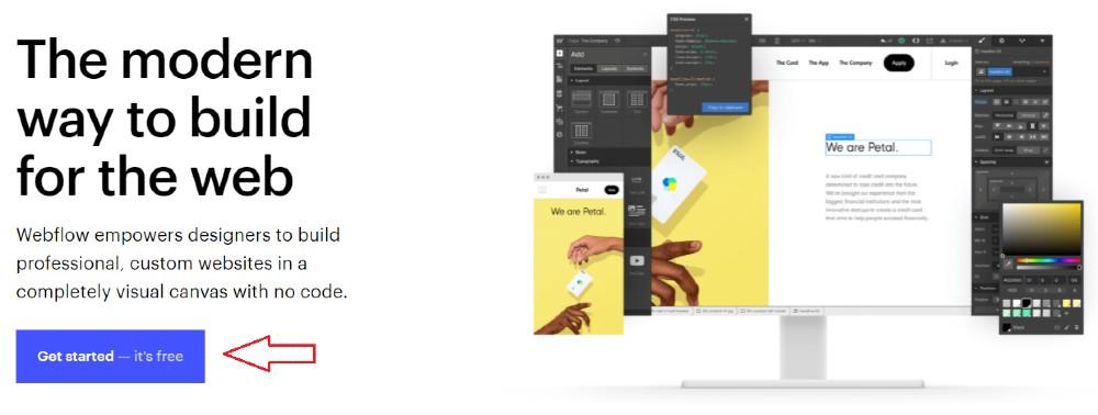
Having a prominent CTA is good. However, a CTA by itself is nowhere near enough to optimize your conversions. You also need a compelling message that reinforces your value proposition to push the prospects across the line. Webflow’s CTA, for instance, repeats that signing up is free:
Something else you can’t afford to overlook is the placement of your CTA button. Some people get great results by placing the CTA above the fold. Meanwhile, consumers in other industries prefer reading what they’re getting before interacting with a call-to-action button. You’ll have to test both options to find the perfect placement for your specific business.
8) Conduct regular A/B tests
Rarely does a marketer nail a landing page on the first try. Even if your first landing page is the best, you’ll never know that for sure until you try out different versions. That’s why A/B tests are critical.
A/B testing involves experimentation of different variables of a landing page. The different variants of the landing page are shown to users at random to identify which performs better. Use these tests to scrutinize different items, from minor elements like font type and color to more significant elements like headlines and landing page design.
You’ll need to test different versions of your headline, landing page design, and CTA design one at a time. Then check your reporting metrics to identify the best-performing elements and compile them to make one optimized landing page. A good landing page builder should have this functionality.
9) Use relevant photos and videos
There are many benefits to including images and videos on your copy. For one, visuals make your landing page more appealing to the eye. A landing page full of nothing but the text comes off as dull, which would increase your bounce rate.
Secondly, videos and images can reinforce your message and give you high conversion rates for your landing pages. However, this will only happen if you use relevant images that add value to your copy.
So if you’re selling a piece of software, add a short video showing your software in action. If you’re trying to get more people to sign up for your webinar, consider adding a sneak peek video on the landing page.
Wrapping Up
It would be disappointing if you managed to drive tons of traffic to your landing page only for them not to convert. But you can easily avoid this by following the above guide.
Start by making a good first impression. Then move on to your CTAs. Use contrasting colors to make them stand out and write an engaging text to increase engagement. If you have a lead capture form on your landing page, don’t make it any longer than it needs to be. Lastly, use visuals to optimize your landing page and social proof to win customers’ trust.
Landing page optimization is a continuous process. If you don’t improve your page continuously, competitors will catch up with you. Therefore, test and optimize your landing page regularly.

Leave a Reply
You must be logged in to post a comment.