
Tools for creating charts are useful but only if the data is well-crafted. Making mistakes in data visualization is easy because it requires a lot of focus and a deeper understanding of what data means.
Some mistakes are funny, some will cause your boss to cross with you. Sometimes it’s due to poor data in the first place but sometimes there is more to it. Your role, in the end, is to create a great, comprehensible chart that can help people understand complex data much more easily and to drive conclusions that will later fuel your business.
You actually have to use real-life data that will affect a real-life business and its future. People depend on you. The business depends on you. And it’s not all about colorful, fun charts. Now you have to actually create something accurate, something meaningful, and valuable to your team.
And this is a lot harder than simply throwing some numbers together.
This is where mistakes happen. But if you know what the common mistakes are in advance, you can learn to avoid them.
Here are some of those common mistakes and some solutions on how to avoid them or even fix them on the go in the first place.
1. Cropping axes

Axes values give context to the chart and the data displayed. If you tamper with the axes you’ll have a completely wrong visualization of your data. This is why you need to make sure that both axes are in line and that both of them start at zero in order to show information properly.
If you need to show a detailed view of a graph, you can show the broad view first and then show details in a second chart instead of risking two fairly close numbers looking like there is a three times difference between them.
This happens so often you wouldn’t believe it. Some do it on purpose because they want to bank on good looks and some do it by accident. Their main goal is to show everything in one chart but that’s often not possible so they cut the axes and it turns out to be a fiasco of data.
People have a certain vision of what a chart should be.
A single chart that shows everything you need to see in a go. But in real life, the chart is never just a single shot. It has so many details and different levels that it needs multiple shots, enlarged, more detailed, or comprehensive.
So, present one shot where it shows the complete chart, but accurate and without any cropped axis – that just looks wrong and it will probably cause ridicule, discredit you, and even cause some serious problem. At the very least, the cropped axis can cause confusion when you present them.
Just imagine how you would react if someone told you that the space between 3 and 10 is actually much smaller or if your percentages didn’t add up. If you need to present a close-up, just enlarge the chart and show different aspects or details. In essence, one overview and several close-ups are what you will need for an accurate, comprehensible, and creative presentation.
2. Data is hard to compare
A common mistake in data visualization is when the chart is too hard to understand.
It’s hard to read data from something that doesn’t even seem comparable. However, it’s all a matter of perspective. You can definitely arrange the data so that it looks better and more understandable to the reader. Pie charts may not be the best choice in some cases but bars put next to each other might.
People often want to represent the data in the most visually appealing way. So, they use images, maps, bright colors, etc. without thinking if that will be understandable for every user. Think about it before you go for it – how will your reader understand that?
Just because you understand general information from your chart, it doesn’t mean that someone else will. So, you need to put yourself in your viewer’s shoes and think about what will be important to them, what they will understand. This is hard sometimes, especially if you are good at deciphering data but not so good at explaining what that data means.
The first step is to pick out a chart type that is best for your data type. As mentioned, pie charts are fun but they are not so great for complex data. On the other hand, bar charts are great for complex sets of data. But, they are often hard to understand by people who are not good at reading data sets. This means that you will need to explain a lot in order to get them to understand what you meant.
For example, if you have an international business then you have to represent the share you have in the market in all of those countries over time. How would you do that with a pie chart? Hardly possible, right? However, a bar chart adjusted for readability would be excellent for comparing these events.
Think from your reader’s perspective. Understand their point of view. You can combine the charts and use pie charts for some closeups of complex data sets or to just show one data sets. But make sure that it is easy to understand as well.
3. Valuing form rather than information

Clarity is the ultimate goal for data representation. It’s all about presenting something complicated in a clear and readable way. However, designers are sometimes so keen on sticking with a form that they have imagined at the beginning that they are willing to risk being unclear about the data in order to represent it in an appealing way.
Some visualizations don’t even use enough space and they use shapes that are not suitable. Pictograms or icons sometimes fall into this category of visualizations botched to fit someone’s imagination. They have the necessary skills and they will do what it takes to both make the chart look good and accurate.
Looking good is not the point of data visualization. Sure, it needs to look somewhat presentable and nice, but it needs to be understandable. That infographic you created with all the bells and whistles looks amazing. Work of art! But what’s the point of it if it’s just going to confuse the people it’s meant for.
In order to avoid these situations, you need to first understand and analyze the data and then opt for a form that will be suitable for that type of data. For example, there’s no sense in showing comparisons in pie charts because that’s impossible.
You shouldn’t worry too much about the looks as long as the data you are presenting is accurate and easy to understand. Don’t cram the data into a form just for the sake of the form.
4. Bad data
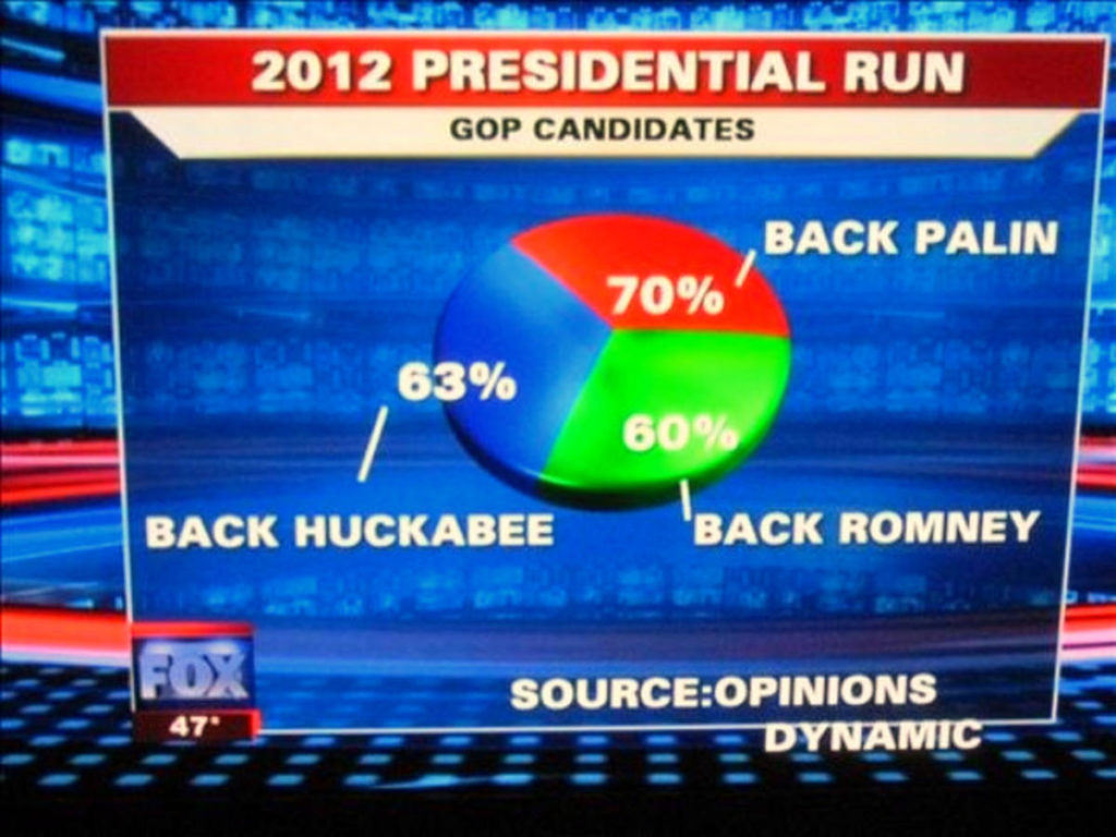
Bad data produce bad data. How many times have you noticed that percentages you see on the chart on TV or anywhere else don’t add up? Too many.
This is why you need to focus on the accuracy of the data instead of going for a better-looking presentation. The numbers should always add up to 100, there is no way around it. Still, some designers feel like there should be more than that apparently since we often see mistakes like these. Double-check every number you enter before you publish your chart.
This is a mistake where it gets really funny. But, it won’t be so funny to your boss. Make sure that all of the data you enter into a chart is accurate and in accordance with the analytics that was done beforehand.
Bad data is something that we often have to face. It’s not easy when you notice that you focused more on the look of the graph than on whether it’s really accurate, That’s why I try to pay special attention to the data and study it thoroughly before drawing up anything. This way, I can be sure that my graphs will be good looking and correct.
5. No annotations

This may not really be a mistake but it’s worth mentioning that it could make the visual harder to read. A small number of words or numbers may bring it closer to its audience and explain what’s happening a bit better. Make sure that what you want to write in your annotations is grammatically correct and spelled properly.
Annotations are important because not everyone can understand what is shown on the chart. Most people would just stare at it, unsure of what is said on the chart. So, you need annotations that spell out everything on the chart.
This will also save you a ton of explaining as you would already have explained everything in annotations. So, make sure that everything you write is accurate and easy to understand. No fancy jargon or slang, no overly complex words, no long sentences.
6. Not Following Conventions

So, following conventions in life, in general, is often not a good thing, but in terms of charts, conventions are exactly what you need.
You see, people are used to certain things, certain behaviors, certain images. Disturbing that causes immediate confusion, even if the image may be accurate and understandable. For instance, people are used to website navigations looking a certain way. You know the drill – the menu is at the top, you have the common home-about-blog-contact setup and then the pages follow a similar template where everything is known beforehand. People like this familiarity. They don’t really like the unconventional where they aren’t sure of the outcome. Especially in situations like visiting websites or viewing charts.
So, even though you might appreciate something different, your audience will like the known. For instance, decreasing value as the y-axis moves up. This doesn’t make any sense as it defeats the conventions that y-axis moves up and values increase. This makes more sense and you should make sure that your charts also follow conventions and are easy to understand to other people.
7. Bubble Size and Values Don’t Match
Bubble charts are fun and an amazing way to show three-dimensional data in two dimensions. You get the benefits of having axes and then you can also use the fun aspects from pie charts. You can also depict a third quantity by simply making the size of the bubble different. This is a great way to represent data and its gaining popularity at the moment.
However, people often make mistakes with bubbles and the most common mistake by far is actually making the radius of the bubbles different instead of simply making the area different to display different values. If you don’t read the text inside the bubble, the sizes of the bubbles could confuse you and make it almost impossible to understand. Since most people consume information visually at first, it’s a big problem if your bubble sizes and values don’t match. Luckily, this mistake is easy to avoid if you simply avoid tampering with the area and just cover the radius.
8. Using too much information and colors

Sure, using colors will improve your chart and make it easy for people to understand and actually feel the data at hand. But there is such a thing as too much of a good thing. And this is definitely one of those cases. Just imagine all of those colors on just one chart – it would confuse people more than you think. It would even confuse you.
Having too many colors at once means that you also have too much information on your chart as well and this is never a good thing. So, before you make your chart and color it with all the colors of the rainbow, make sure that there isn’t too much information on one chart at once and figure out if it’s better to create several charts that will look better and be easier to understand. Five colors is a good limit and you should really stick to it. For businesses that require professional, accurate, and impactful data visualizations, it’s often best to hire tableau developers.
Wrapping Up
Creating graphs can sometimes take a lot of work and knowledge. It’s not just one click and it’s done but it requires a lot more work than that. You should always check your data before you start creating based on it, make sure that you don’t cut the axes because that could botch the results and follow all these other tips on how to create good graphs and avoid mistakes that lead to misunderstanding.

Leave a Reply
You must be logged in to post a comment.