A long time ago, when the Internet was still fresh and people didn’t know what worked, and what didn’t, it was common to see websites that looked like this:

That’s an actual photo of the Apple website of old. Doesn’t look like anything of today’s version.
On one hand. The technology to create beautiful websites has improved. Designers aren’t constrained by bandwidth limitations anymore, so they can insert rich graphical elements such as full screen photos, videos and other rich media.
But more importantly, website creators the world over have managed to narrow down on a set of best practices that have proven to work, both in retaining users and increasing conversions.
One such important principle is white space.
What is white space ?
Also known as negative space, this is any part of your website that is empty, meaning it doesn’t contain any sort of element. This means no buttons, no fonts, no text, no graphics, no nothing. Just clean, empty space.
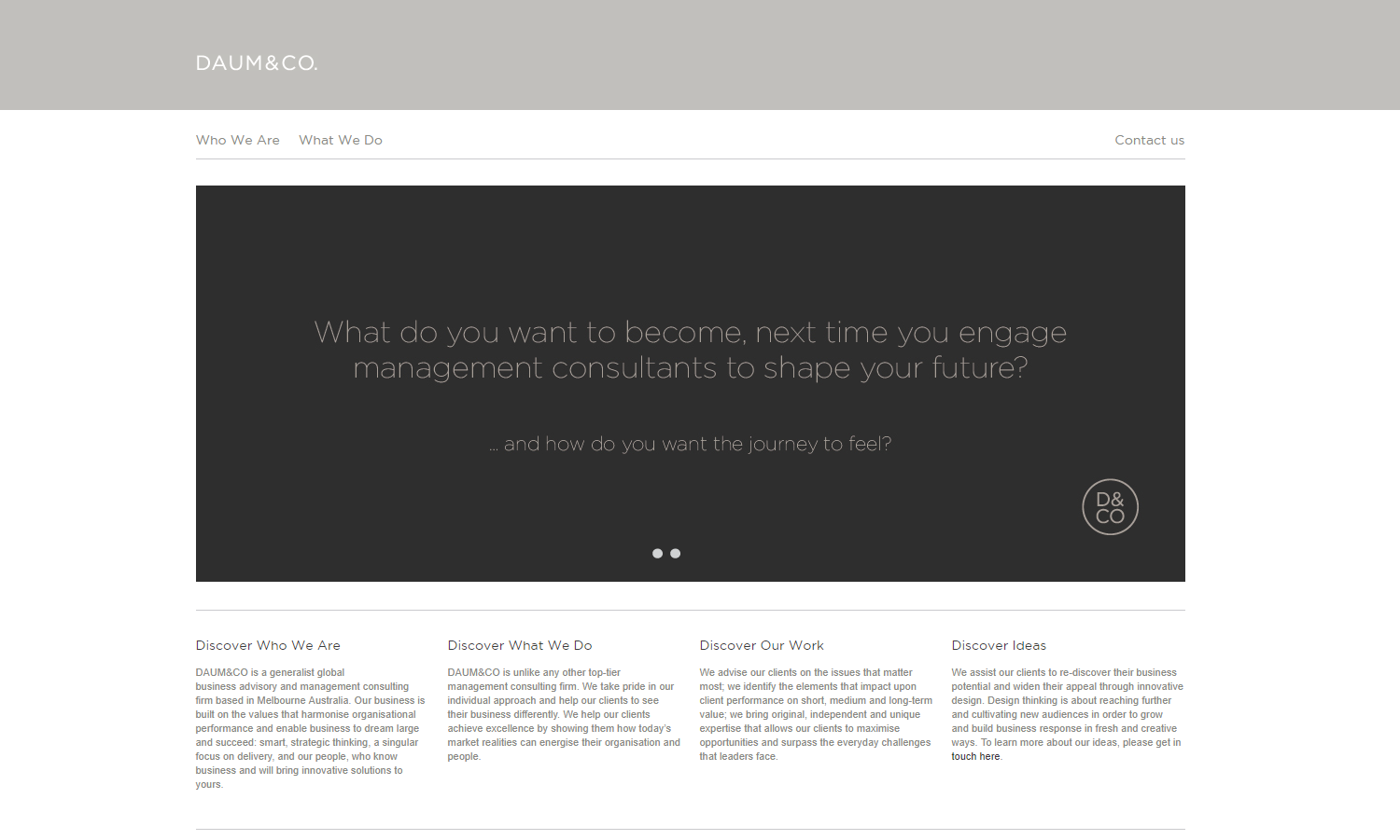
Of course, it doesn’t actually have to be the color white. Any empty space that is devoid of functional or graphical elements counts as white or negative space, as seen in the website below.

White space works by directing the eye of the user to only a few critical elements on the site, guiding both his experience as well as his actions. Simplifying the experiences reduces user confusion, which in turn improves engagement. Because of this, white space is one of the most important considerations when one wants to create their homepage or website.
Why shouldn’t I just fill up the white space with “useful stuff”?
A legitimate question. A website owner might be tempted to fill up a site with ad space, or other call to actions. But doing so risks hurting a site’s usability, and diminishing it’s traffic. Lower traffic = lower revenues.
Taking this into account, here’s how “doing nothing” and just using white space can take a website’s design up a notch.
Dark fonts on white background are easier to read
There’s been a lot of trial and error regarding what is the best combination of font color and background for readability. Time and again, the traditional black-on-white format has come out on top. This is because readability is primarily a matter of contrast, and no other format can come close to black-on-white, including white fonts on dark backgrounds.
This is because of the anatomy of our eyes. In short, white backgrounds tighten your iris and focuses your eyesight. This in turn makes it easier to read and dark texts that contrast with the white.
If however you use black as a background, it has the opposite effect of opening up your iris so it captures more light. This is a problem because 30%-50% of the population suffers from some form astigmatism, meaning they perceive experience “blur” when their eye is out of focus.
Below is a small graphic that shows just how the whole dark vs white font affects your eye site, courtesy of uxmovement.com.

White is neutral and safe
Colors are an important branding element, so choosing the right one for a website is a critical aspect of web design.
Sometimes however, there’s no clear cut and obvious way of choosing a good background color. So the only thing left to do is to choose one that nobody will have a problem with, and almost always that color is white.
Images look better on white
The principle is similar to how you match fonts and backgrounds in order to get good contrast. Almost all photos, regardless of what colors they use, will look good on a white background, since white allows them to stand out.

Websites look better in white
Black is usually the color we associate with elegance and sophistication, but white comes a very close second.
It is minimal and understated, designed to make people concentrate on the content and not the form it takes.
In web design, white doesn’t needlessly distract with useless information, and so let’s the user breathe and focus on the crucial aspects of a website.
By using a photo editor, web designers can manipulate images to create white space by removing or cropping out unnecessary elements, creating a cleaner and more visually appealing design
White reduces clutter and brings focus to CTA’s
This is another important element to consider when choosing white. Because it’s such a light color, that doesn’t take up space, white doesn’t add to clutter on a web page.
Thus, white space can have a positive impact on conversions, since it eliminates distracting elements that would prevent a user from clicking a button.
VWO has an interesting case study that supports this, where a Dutch medical association had an 8% uptick in conversions simply by removing an orange stripe from the design of their site.

Websites that elegantly use white space
So that was the theory of white space, below you’ll find a few websites that make use of it in the best way possible.

2. Daum & Co.


Leave a Reply
You must be logged in to post a comment.