
eCommerce is not a field where you can get success following a single formula. However, there are certain phycology principles and UX tricks that are proven to work. But above all, you must make sure that you’re not making design mistakes that make visitor exit quickly. For any eCommerce startup, it is essential to understand these mistakes and find solutions to avoid them. Here are common 10 mistakes that keep your website down.
1. Failing to make the first impression
You have 7 seconds to make a first impression on a person you’re talking to. How is it different from interacting with your customers online? You have much less time! It takes only 50 milliseconds to form an opinion about a website. That gives you a very short span of time to attract visitors and form a positive image of your site. Fail to do this, and even those who end up browsing the site might end up being skeptical.
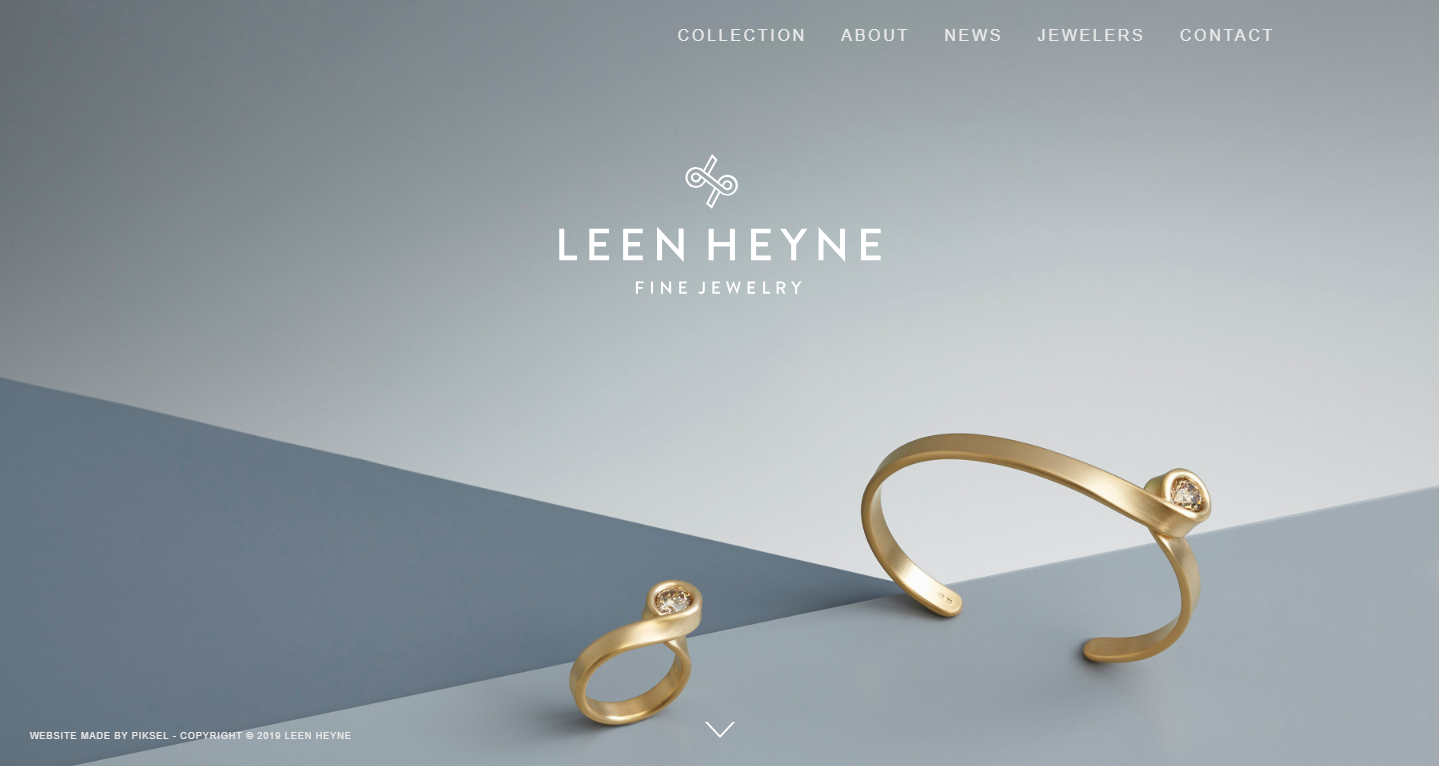
Go for bold imagery and a short but clear headline that communicates what your brand is all about. The first impression is a subjective thing. The best you can do is to try to learn from other brands. Here’s how Leen Heyne pulls it off.
2. Desktop-only design
More than half of the worldwide internet traffic is from mobile devices. Depending on the country, you may be missing anywhere between 20% to 60% of customers simply because your website is not mobile-ready.
Even those sites that try to be cross-platform may fall short of expectations. Miss one type of display, a new phone, or make leave a big animation on a small screen device, and customers will flee.
Here’s what you can do to attract mobile users:
- Follow mobile UX.
- Strip down the website to the basics.
- Hide any elements that would unnecessarily slow down the site.
- Less use of JavaScript.
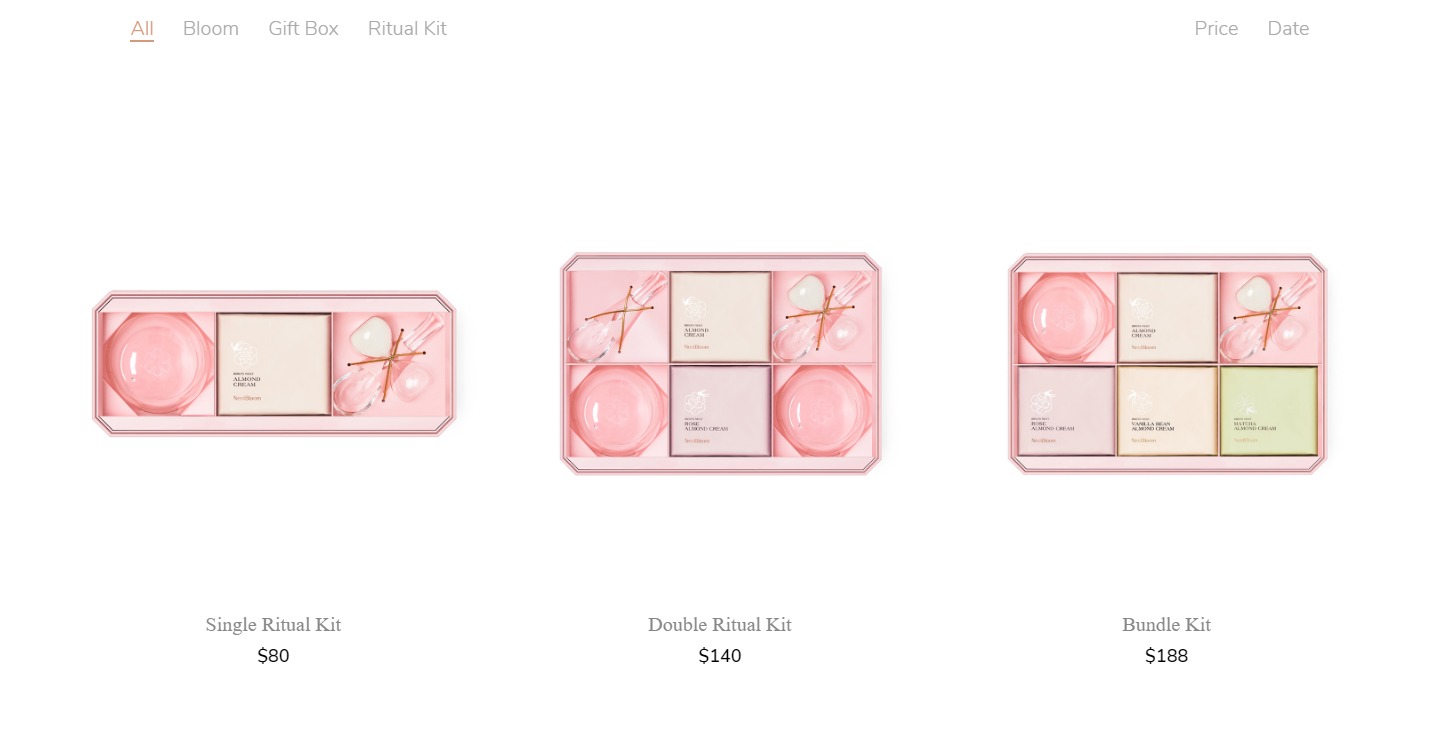
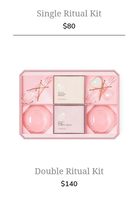
Look at how Nestbloom changed their shopping page for mobile.
3. You copy is bad
You don’t have to fire your copywriter right away. Not yet, at least.
Creating a convincing copy is not something you can do overnight. While there are some general patterns that attract people more, figuring out what works for you is a long process.
Here is what you can do to make your content better:
- Deliver a convincing message.
- Make the content readable.
- Focus on customer intent.
- Explain the products well
When you’re making a product card, the odds are most people will skip the description. Make sure to add all the necessary information about your product. If you’re selling clothes, here’s what you may want to include:
- Size chart
- Material
- Cleaning requirements
- Manufacturing information
The list will differ greatly for any product that you sell. You may take Amazon for reference when deciding on what to include in the product card.
4. Your website is hard to scan
More often than not, all the work you put into a piece of readable content is pretty much wasted. It will only be read by a small percentage of readers.
But that’s not something to be upset about. That content few people read fully can still help others. Most people will simply scan through it, looking for a particular piece of information they need.
This is why you should make it scannable. Here’s how you do it.
- Use short sentences.
- Use short paragraphs.
- Break content into headings and subheadings.
- Use bulleted lists.
If your website is still hard to scan, it may be time to consult a professional web design agency that can enhance readability, layout, and user experience to keep visitors engaged.
5. Your site is hard to browse
This problem comes up in the eCommerce field quite a lot. Smaller websites with less than 50 pages are mostly easy to navigate. There simply isn’t that much content that you may want to find.
If your website has hundreds of pages, users may not find what they are looking for and head over to competition. Implement best practices of navigation to ensure no one leaves unsatisfied.
Here’s what you do to help users browse your website:
- Put all the relevant information on every page in footer and header.
- Put products in categories.
- Create consistent breadcrumbs.
- Attach images to subcategory pages’ links.
- Make it easy to find contact information.
- Create an easy search tool.
6. Bad product photos
People won’t buy your products based on the words themselves. In fact, many small online retailers are hurt by not working well enough on their product photos.
If you are selling custom products, you may want to hire someone competent to take pictures for you. Take inspiration from the kind of photos you may see on an Instagram page of a successful retailer.
You don’t have to invest in expensive cameras and equipment. All you need is a good brand style and showing your product in all dimensions and shapes.
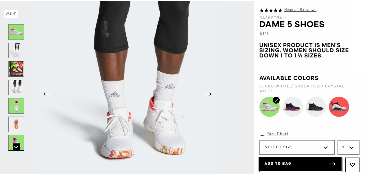
Take a look at how Adidasdoes this.
7. Ineffective CTA
Follow the example of Adidas to create a compelling call to action. Give your customers a way to choose the size, quantity, and color. Having a picture of the product in the color of choice is going to make the decision easier.
Make the “add to cart” button stand out. Upon clicking it, your customers should see some visual feedback to know the product is added to cart. Otherwise, they may be confused, and add products multiple times.
If you’re selling services, however, your CTA may be damaging to your sales.
If it’s either not clearly visible, or not compelling enough, it may not direct enough people towards the action they should take next.
Make it stand out. This doesn’t mean a huge red button, just make it visually different from the surrounding.
Try placing the CTA below the fold. Create a narrative on the page that would explain the product first and then place the CTA button.
Make the decision easier. If the first month of service or a quote is free, make sure it’s right there near call to action.
8. Ineffective shopping cart
If you’ve been in e-commerce for some time, you know what shopping cart abandonment is going to businesses. People choose the products but do not proceed with payment.
You need to make authentication and purchasing process as easy as you can. Use Google or Facebook authentication, as they’re both easy one-click solutions and leave you the person’s contacts.
Having the tools to bring back people who abandoned their carts is another thing that helps your website grow. This includes both working with leads and improving your website. Here’s what you can do:
- Add more payment options
- Strip down the checkout page to the bare minimum
- Send emails offering a gift or free shipping to people who abandoned their cart a while ago
You should also try to encourage customers to return to your store after they’ve left their cart without a purchase. The most advanced eCommerce systems such as Shopify and WooCommerce have easy options to email your registered visitors to reduce cart abandonment.
9. You fail to build trust
People trust online shopping less, especially in the fashion niche, since they can’t try the products on. This is why building trust is essential to generating sales.
Slapping the “Forbes” badge above the fold won’t do it. This is so much overused that people are likely to have developed banner blindness towards it.
If you were mentioned in the news, provide a link to it instead of just saying you were. Feature reviews, preferably the ones your users can verify. Use Instagram photos of people using your product, and encourage new customers to take them.
10. Your imagery is dull
Generic imagery is killing creativity in website design. If the visitors see a flat style vector illustration you purchased from a stock website, they will think you’re just another website that has nothing unique to offer.
Investing in an illustrator on Fiverr or a similar resource won’t cost you much more than buying a good stock image. But for the couple of dollars extra, you’ll get a style that no one else has.
Conclusion
Designing a website to maximize performance is not a simple task. However, it can be done efficiently, if you know the key areas to improve. Implement all the points above, and your conversion rate will improve over time.

Leave a Reply
You must be logged in to post a comment.